The watch, like a force of nature, is as delicate as it is powerful.
What is an independent watchmaker brand?
There is no explicit definition of an independent watch brand in all of the relevant literature that I have scoured. Some define them more of what they are not, as opposed to what they are. They aren’t part of huge conglomerates such as LVMH, Swatch or Richemont. They are not financially supported by any other parties to survive and they are not high revenue companies like Rolex or Patek Philippe. Some define indies as owned and run by a true watchmaker or watchmakers. Whatever the definition, some companies qualify for those definitions and some fall in the gray zone (not the grey market). Rolex for example is a totally independent company in that it does not fall under the jurisdiction of any multinational but hardly anyone would classify Rolex as an independent brand due to its sheer market revenue and thus dominance.
The best definition I can collate from my readings is that an independent watchmaker is not a mainstream brand, in terms of total market share. With watchmakers that share an independent vision for watchmaking including mechanism, aesthetic and direction, they target a niche population. A great example firsthand is the brand Czapek Geneve, whose motto is “We collect rare people”. I think independent watch brands aim for rarity, exclusivity and difference like the eclectic shapes and materials of MB & F or H. Moser.
Whatever the definition, there will certainly be overlap amongst brands and consensus can never be reached on what is an independent brand. But there need not be a definition. For our intents and purposes, the landscape is rather simple. For the current state of the market and innovation if not part of Rolex, Patek, Swatch, Richemont, LVMH and AP well we might as well call them indies.
HAJIME ASAOKA AND THE KURONO BRAND
Hajime Asaoka is an independent Japanese watchmaker who produces his own brand under his namesake and his pieces are generally considered quite haute horlogerie complicated pieces that retail for quite haute horlogerie prices. The problem is that his signature pieces like the Tsunami, even though quite pricey, take years to be produced and delivered. If you can contact the master himself, since it is quite difficult, he will take your order and produce your timepiece in a bespoke manner. He is to me, the Japanese Phillipe Dufour, the Japanese F.P. Journe.

Hajime Asaoka Tsunami 
Most of his haute pieces are in a price range that rules out most watch buyers so he decided to create a very affordable lower line named Kurono Tokyo. These watches are also limited in production and are designed by the master himself, however they house third party movements from Japan’s Miyota. The Kurono brand, a Japanese homonym for the English word Chrono is priced very affordably and was produced to be more accessible for the general international watch population. The master himself, an art designer by training, specifically designed this line to be worn as everyday wearers, even for himself. Again, the problem was that this line was sold online on a first click first serve basis and the limited watches were sold within minutes around the globe and getting your hands on one retail has proved quite impossible. Is that a situation that we are all typically familiar with? It also rather sounds like a very mainstream brand to me.
KURONO 1st ANNIVERSARY EDITION: THE MORI
For the Kurono brand’s first anniversary, Hajime created the green Mori (Japanese for forest) a la Rolex and the initial 50 limited pieces sold out in 42 seconds. There was a software glitch in the ordering process, so the brand decided to issue another 238 pieces which is explained in detail by The Watch Guys.
After having read about Hajime’s Tsunami and the Mori by Gary G from Quill and Pad and viewing the video by The Watch Guys, I ruminated seriously about this brand and specifically the Mori for a while. It was shall I say, an acquired taste and after careful thought I decided to take the risk. One can honestly call it a risk since it was from an indie brand and I had not ever purchased a non mainstream watch before. The other risk was that I had to purchase it from a grey dealer since this edition had already sold out completely and orders were closed. I am 100% happy with the “risk” I undertook and very grateful to Andy the dealer from Toronto who is much more knowledgeable about Hajime than I am which also reinforced and reassured my purchase. I paid a significant premium on this watch but it was well worth it since Andy shipped me an authentic unworn Mori which is now increasingly difficult to find.
THE PACKAGING
Does anybody care about the packaging of a traditional watch? Maybe when unboxing an exquisite wood Patek box but after a while the experience gets well, experienced. So is it worth mentioning the packaging of this watch then? Yes because the packaging is so simple and humble, that it speaks of the watchmaker’s priorities, intent and vision. The watchbox itself is made of elegant cardboard and is not impressive in size. The box is wrapped in a tsunami blue scarf and the warranty is stamped on a piece of paper. The watch also comes with a little bracelet with the Bunkyo Tokyo logo. Bunkyo is the city or town where the watch was manufactured.
The packaging can be described as very humble and elegant and I must say it is more than adequate for its pricepoint. Furthermore, it is an example to mainstream watch brands stating that the packaging does not need to be elaborate and that the timepiece should be the highlight. In fact, the manufacturers could significantly save themselves and the consumer a lot of money by not producing such extravagant watch boxes. I, for one, would be content with a more humble box for any tier of watch.

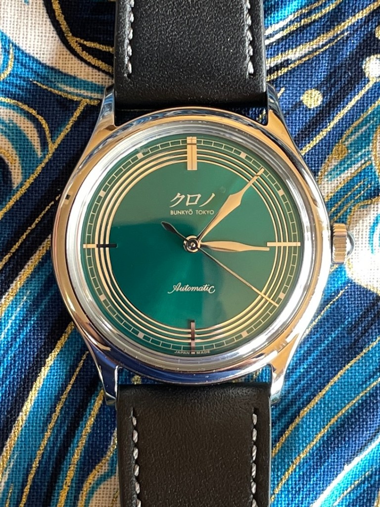
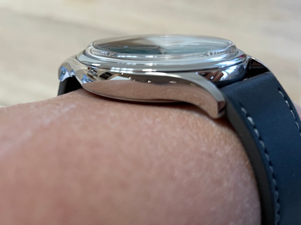
THE CASE AND DIAL
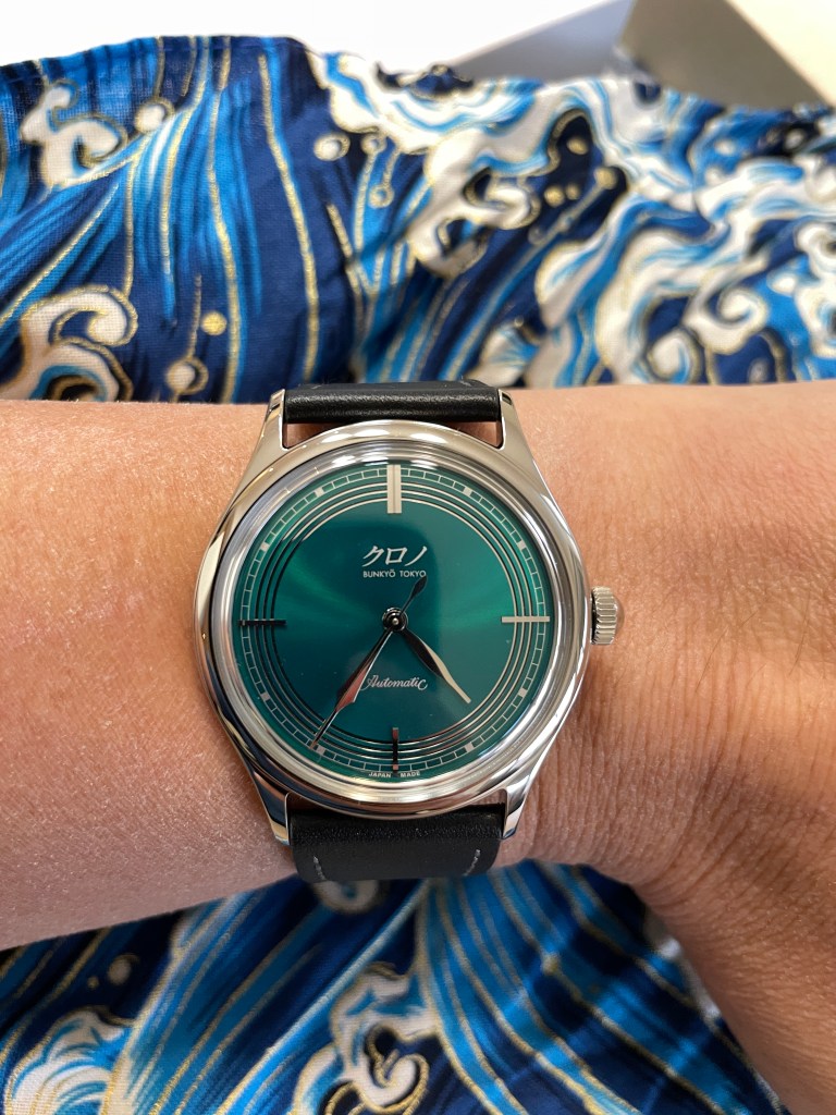
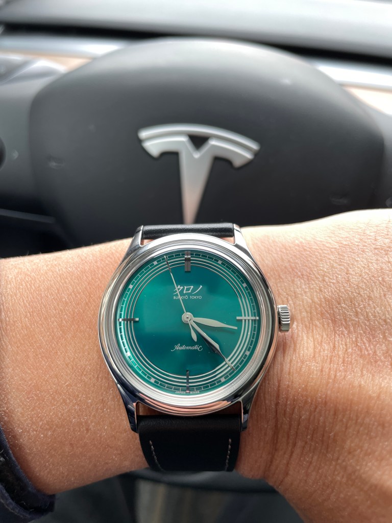
The main draw to the Mori is unobjectedly and unequivocally the dial and the case combination. Its case is made of stainless steel and measures 37mm in diameter which wears very comfortable and light on my 6.5 inch wrist. It is quite a thin time-only watch and fits very well even on larger sized wrists.
The dial is the reason why I and many others bought this watch. It is a very unique light jade opaline green and does not do service to its Mori forest namesake. While forest green is a deeper and darker British racing green, this shade of green, or rather shades, shines bluish turquoise silvery. The hues change depending on the angle and the lighting and it’s unlike any green I’ve seen before. While the Rolex Hulk Green and the Rolex Green Daytona are more sunburst and darker greens, this Mori shines more metallic and opulent. It is a more refined mixture of metal and dye making it more polychromatic. Needless to say my photographs do not capture its vibrant essence and one has to see it to experience it. Apparently Hajime spent much effort in creating the perfect concoction of this green for the Mori and I’m very curious to know if all the Moris are uniform in colour or if each piece is unique. I’m hoping the latter.
The stainless steel hour hands and markers in combination with the three chapter rings which encircle the dial are to me equally as important as the green dial colour. Their placement on the dial and their relative occupation of space tells me that Hajime must have experimented with their size and thickness with countless and meticulous repetition. I just find myself staring at that dial more than any other watch I own or any other watch for that matter. The proportions and reflections are perfectly designed. Were it not for the three concentric chapter rings the Kurono would not be unique nor would it have merited my purchase. I actually think Hajime should patent those chapter rings if he hasn’t already done so. The three Japanese characters are pronounced Kurono. The Kurono models that display the English word Chrono were manufactured for the Japanese domestic market and the Japanese character logo was marketed for the international market. That’s a little backwards to me and I prefer the Japanese characters because it renders the watch more authentic.
STRAP, CLASP AND MECHANISM
The strap is a soft leather which wears very light and comfortable. It wears tight enough to adhere but yet allows for breathability. The clasp is a regular pin-buckle system which is also quite reliable.
Again like the packaging, nothing to write home about but the elegance is in its simplicity.
The caseback is closed because again the Miyota 90S5 mechanism is nothing to write home about. The movement is certified at -10/+30 secs per day but since I am quite fussy about accuracy, I timed the watch to my standard, the Hodinkee app. The watch ran fast but by no more than 4 secs/ day which is perfectly adequate for my needs. In fact, I measured +2 secs/day on average so one need not worry about its accuracy if ever there was a concern.
My only criticism of the watch is that it is sometimes difficult to discern the hour hand from the minute hand but that is not a dealbreaker.


OVERALL IMPRESSION
My first impression of this watch on unboxing was one of awe. When I first the saw the dial, I considered it a work of art and I immediately wanted to return it in the box and I didn’t even feel like creasing the strap for fear it would not remain pristine. It took me a few days before I couldn’t resist any longer.
Having never bought an independent watchmaker before, I am very content on this piece being the first. No it certainly is not a Rolex or a Patek Philippe. It is a watch that was designed by a master artist with a keen eye who placed himself in the consumer’s mind’s eye. He imagined what the consumer would see and thus designed it accordingly. It is not a tool watch to be battered around but rather an elegant, delicate and sensitive timepiece. It has been clearly designed from an artist’s sensibility, from an artist’s eye. The calculated metallic reflections melding with the dial colour reflection impress upon me a strong metallic aura that is far from industrial. It is as if Hajime laid down the dial metal as delicately as a jeweller would gemset a precious tiny stone. The circular shapes and curved hands project a natural look like the forest it was intended to represent. Like a non uniform, and seemingly random tree in the forest it projects its beauty naturally and effortlessly.
This will not be my only purchase from the master himself and I will be eagerly be monitoring the Kurono website to see if I can actually obtain one at retail next time. It is well worth it but guessing by the state of the market today, millions of others must have already clued in. But nonetheless, at least I have my Mori in hand. Having sampled the master’s work though, it makes me long for a timepiece from his own brand, namely the Tsunami one day.
